


LOGO DESIGN // BRAND ASSETS // WEBSITE DESIGN // PHOTOGRAPHY // VIDEOGRAPHY
As its product portfolio grew beyond inks and coatings, Wikoff needed a rebrand to launch it into a new era.
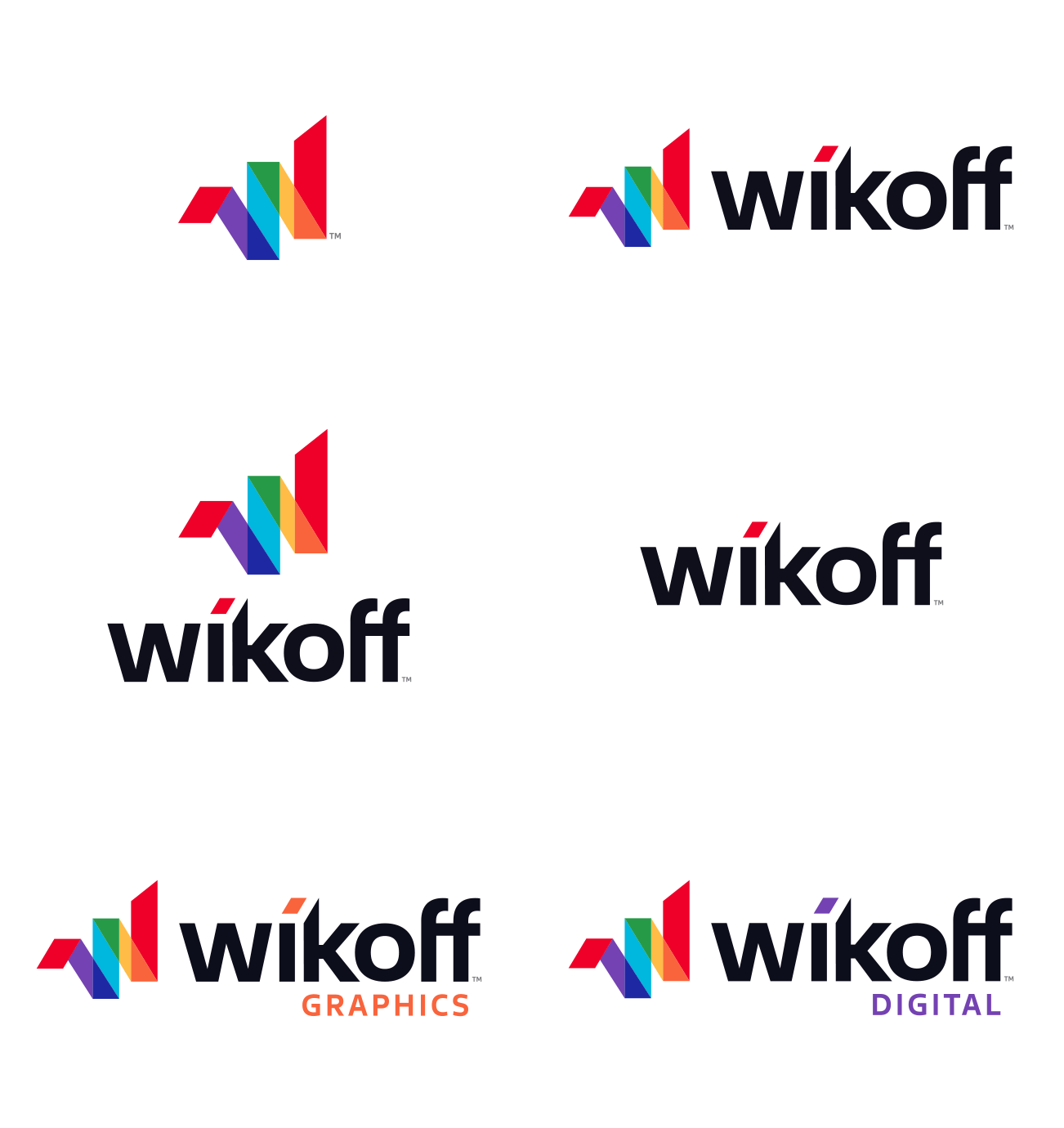
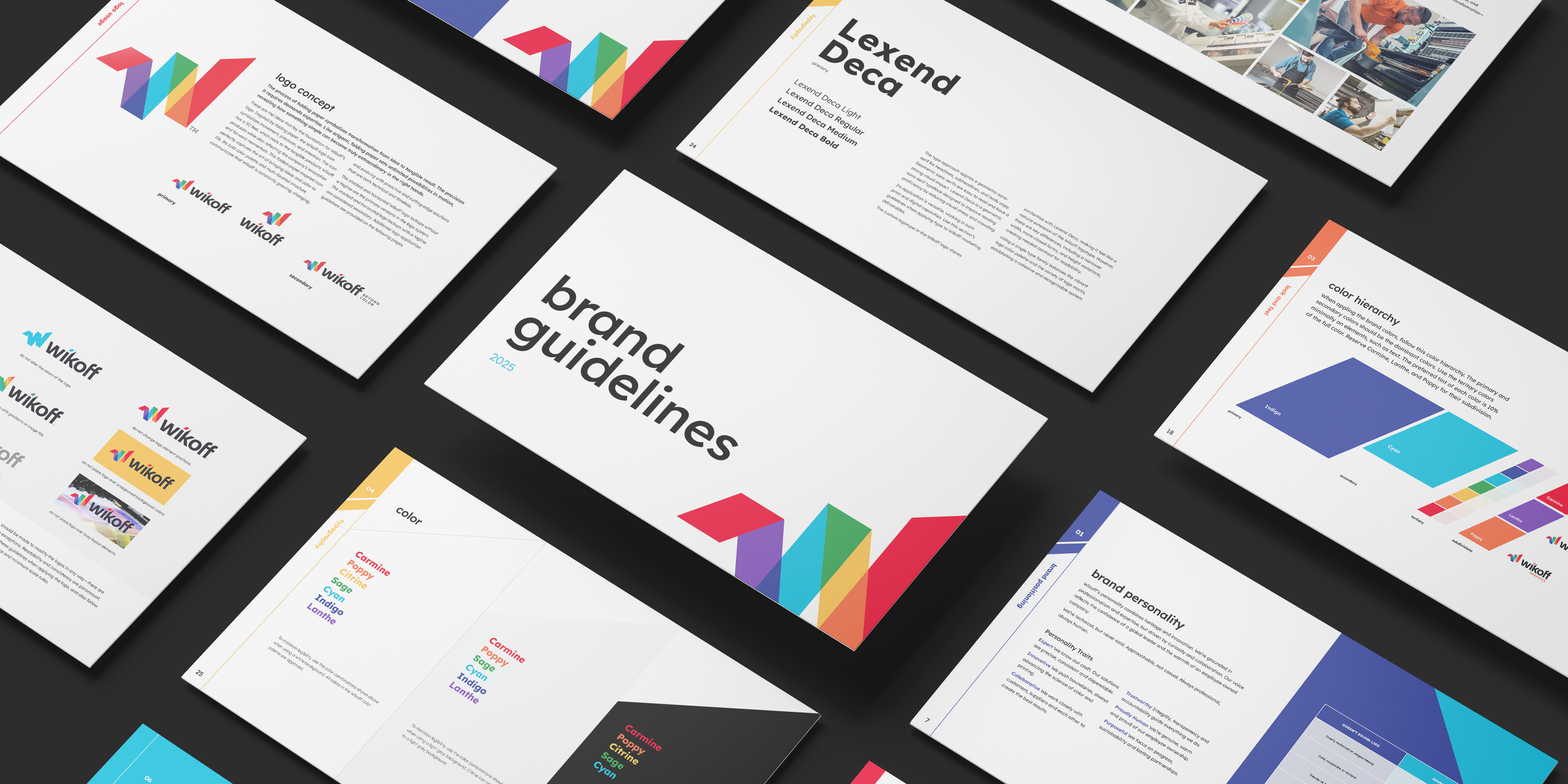
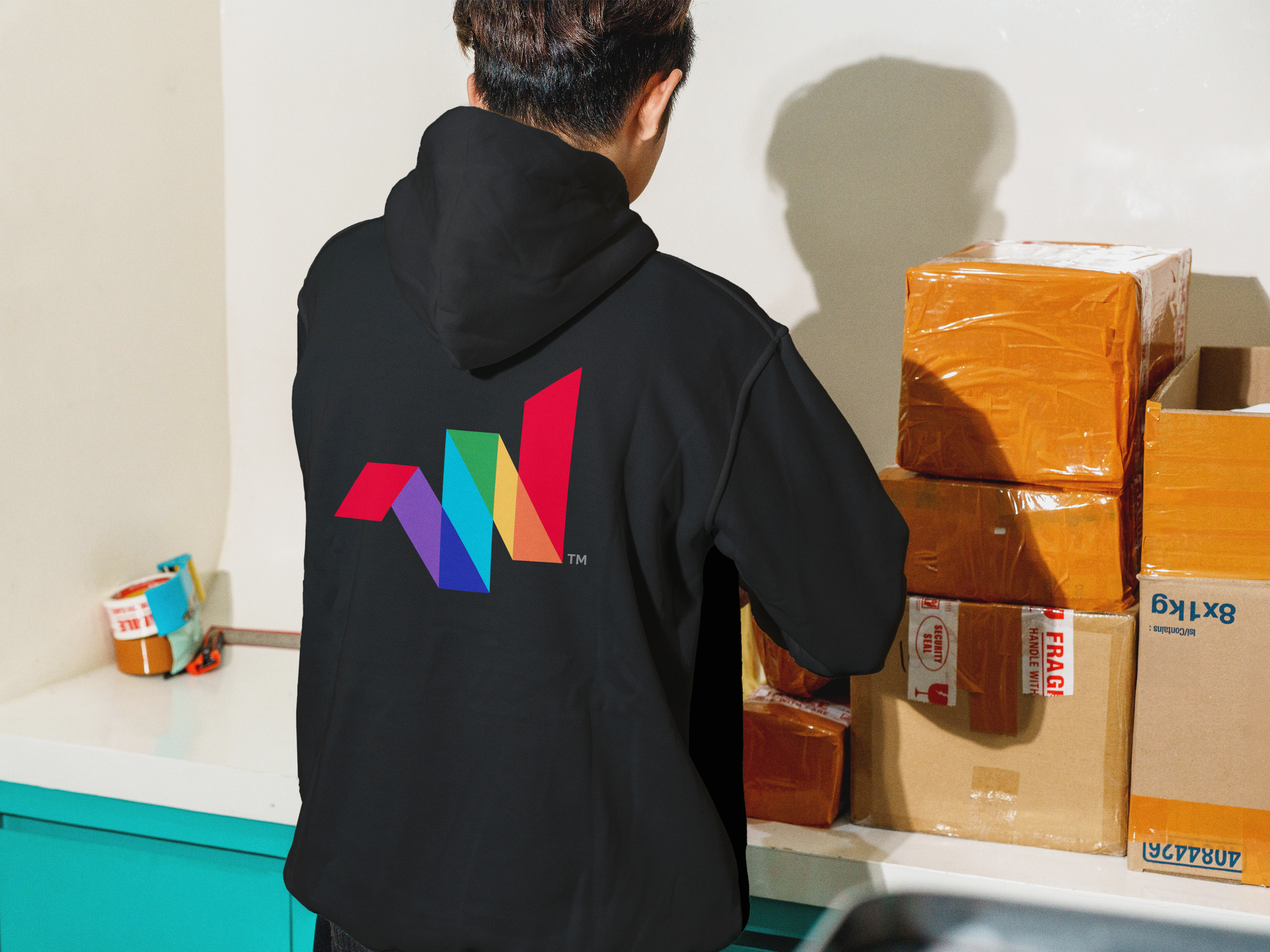
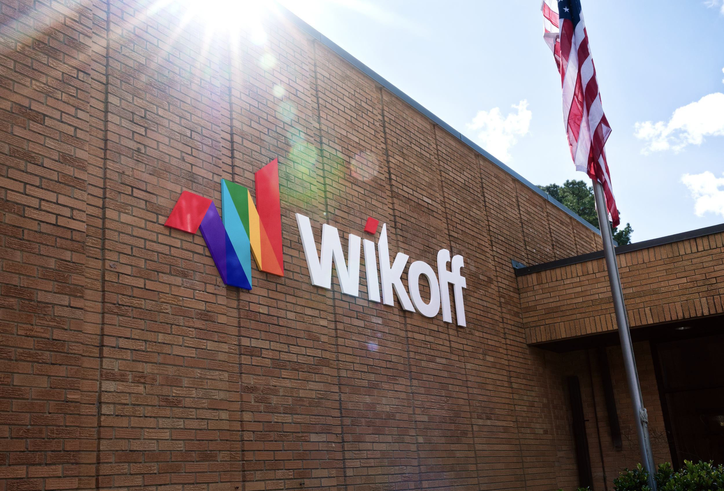
Inspired by the folds of paper, the new logo symbolizes movement, precision and intention. The ‘W’ icon has a 3D feel, which reflects Wikoff’s innovation and forward momentum, perfectly capturing the art of bringing ideas and color to life.

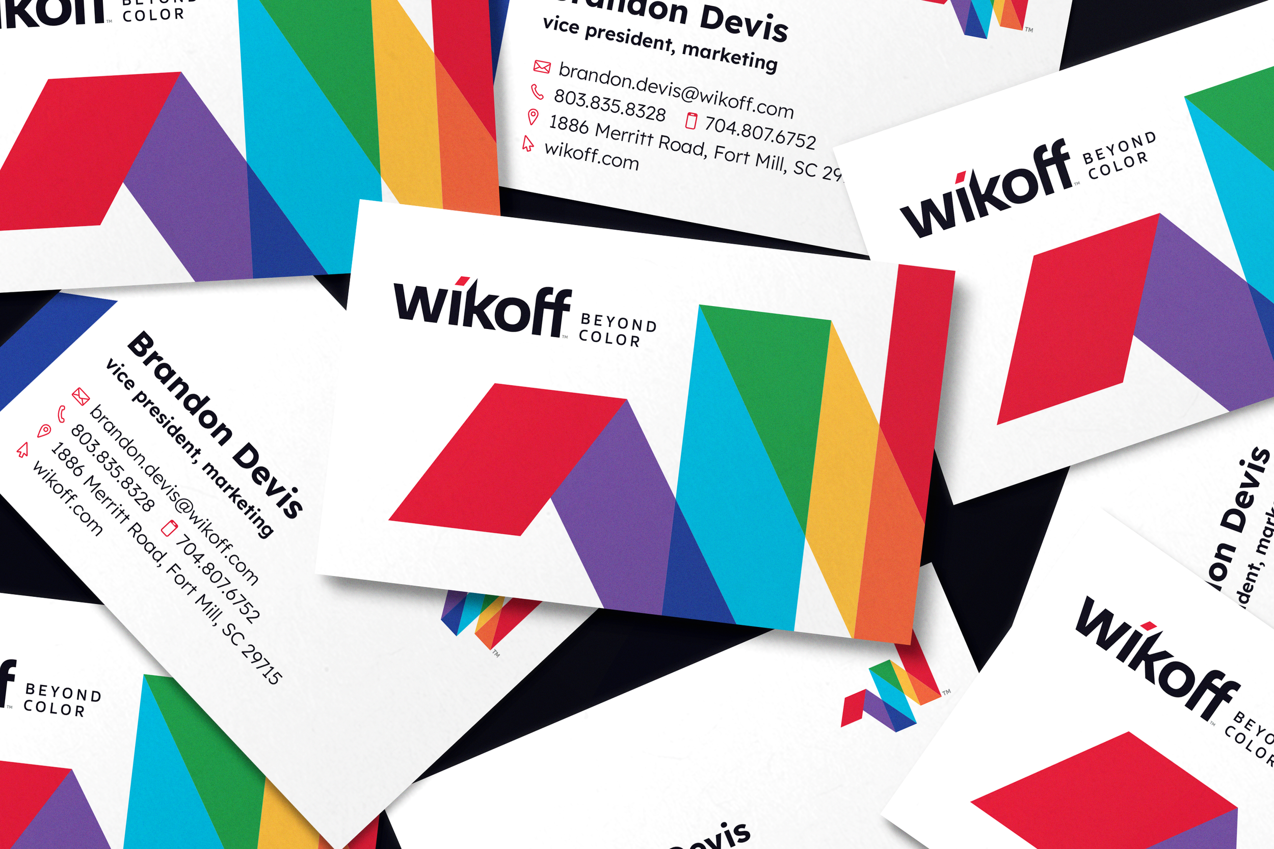
The 7-color palette, featuring Wikoff’s signature red, is inspired by the color wheel as a bold nod to what started it all.
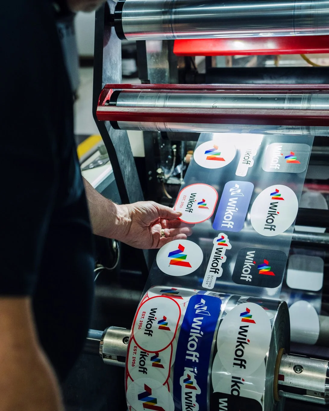
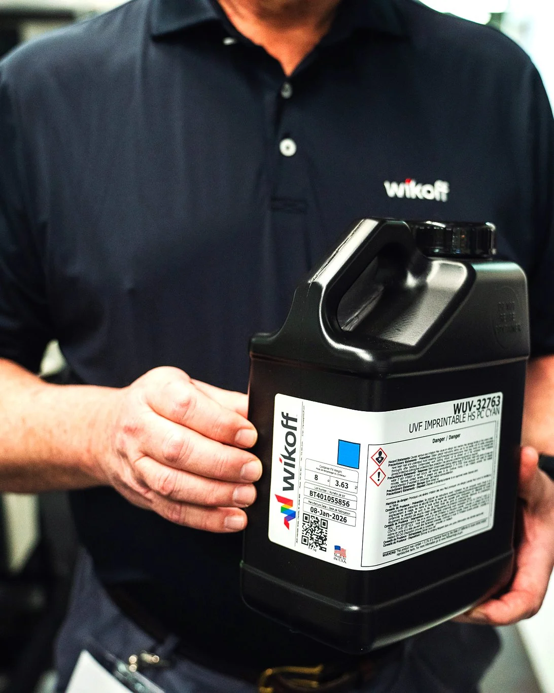

The new site transforms Wikoff and its sub-brands into a single, cohesive digital experience built around effortless product navigation and a more colorful, modern design.


Old logo for reference